Understanding math and numbers may be challenging for some people, particularly when comparing a large amount of data simultaneously. On the other hand, a graph may simplify things for you because the facts or figures are rendered into an easy-to-follow visual in the form of a chart.
You could also need a different kind of graph for each set of numbers you are working on graphing, depending on the types of data you are working with. For instance, if you want to compare the various colors of shirts worn in your school, you may use a bar graph or pie chart. On the other hand, you might use a line graph if you wish to link integers in the form of a line.
How Are Graphs Different From Charts?
Charts may take the form of graphs. Graphs, diagrams, tables, and other types of visual representations of data are all examples of charts. Charts are a technique to communicate information visually. Therefore, although graphs can represent all charts, not all can be represented by charts.
Seeing as this is unclear, it may help to remember that graphs are where one may find graphical representations of mathematical connections.
Importance Of Graphs
A graph may be used for various purposes, including comparisons across categories, tracking change over time, presenting data in discrete intervals, and many other things.
A data collection may be quickly visualized using a graph since that is its function. Understanding and detecting patterns and trends in the ever-increasing flow of data requires a critical component: the graphic visual representation of information. Drawing line segments or plotting points in graphs are two of the many methods included in this method. It is used to clarify, understand, and evaluate the data.
Various Elements of Graph
Title
The title of any graph is significant because it conveys to the reader the nature of the data being represented by the chart. It is usually relatively brief, but you may make it as imaginative or straightforward as you want so long as it explains the graph’s content appropriately.
Legend
The legend of a graph explains what each line on the chart signifies. This helpful tool will assist the reader in better comprehending the diagram.
Source
The source identifies for the reader the location from where the information in the graph was obtained and gathered. Acknowledging the individuals who discovered the information you are utilizing when creating a chart is crucial and should not be overlooked.
Data
The data being handled constitutes the essential component of any graph. Depending on the kind of graph, there may be a single group of data displayed at a time or numerous groups of data presented simultaneously.
Y-Axis
Depending on the kind of graph being used, the position of the y-axis will seem different. For example, the y-axis of line graphs extends in a vertical direction and often includes numbers corresponding to the quantity of whatever is being measured.
Typically, 0 marks the beginning of the y-axis, which may then be segmented into equal pieces. In bar graphs, the y-axis may also run vertically; however, this orientation of the axis does not usually occur. It is possible to create bar graphs in a horizontal format, where the y-axis will be aligned with the horizontal plane.
X-Axis
The graph used determines the position of the x-axis, like that of the y-axis. For example, the x-axis of a line graph extends across the page in a horizontal direction. It often contains numbers representing various time periods or the names of entities being compared. Similarly, the x-axis in bar graphs often extends horizontally across the page.
Types of Graphs
Some exciting types of graphs are mentioned below:
Bar Graph
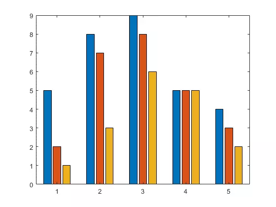
A bar graph is a graphical demonstration of grouped data in horizontal or vertical rectangular bars, the length of which is linked to the measure of the data.
Bar graphs may be either horizontal or vertical.
Line Graph
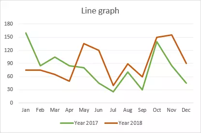
A line graph is a form of a diagram that illustrates the change over time of points and lines. To put it another way, it is a line connecting numerous points or demonstrating the link between them.
The graphic illustrates quantitative data between two changing variables by connecting a sequence of succeeding data points with either a curve or a straight line. The line or curve may be conventional or curved. A linear chart’s horizontal and vertical axes link and contrast these two variables.
Histogram
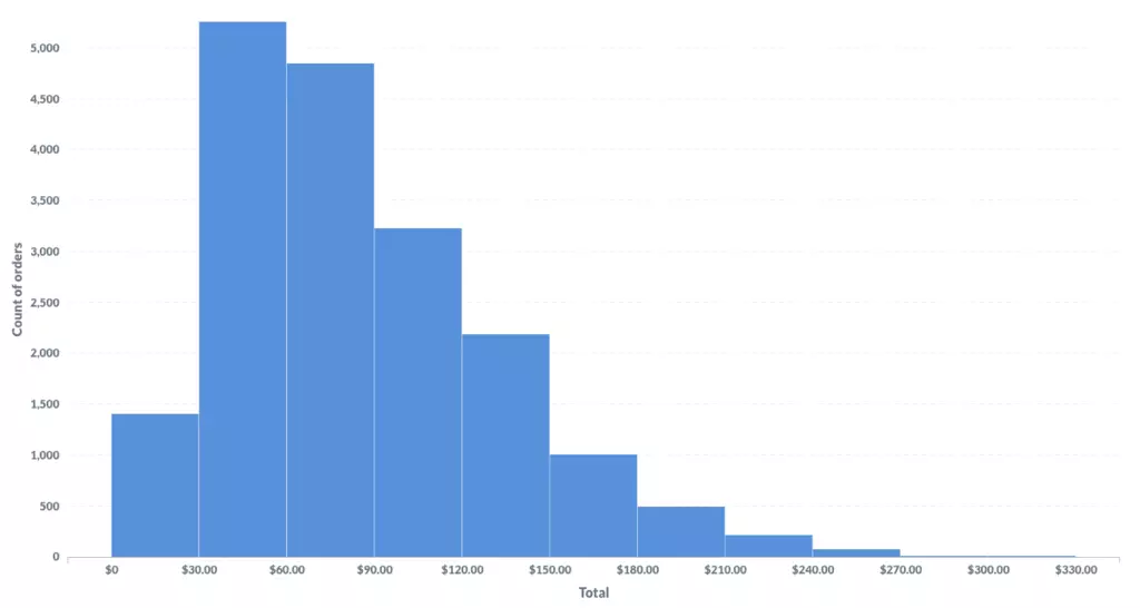
It is a graphic that uses linked rectangular bars to illustrate the frequency of discrete and continuous data within a dataset. In this case, a bar chart in the shape of a rectangle shows the number of observations that fall within a predetermined class interval.
Pie Chart
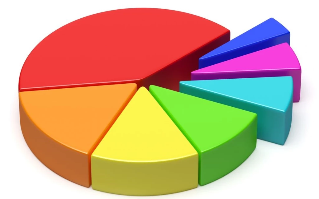
A numerical illustration of a dataset that uses a pie chart to show the magnitudes of the data. To create this graph, a circle is segmented into several sectors, and the percentage of one element that makes up the entirety of each sector is represented by the process as a whole. A circle graph or circle chart is an alternative name for this kind of graphic.
Exponential Graphs
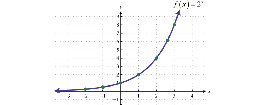
An exponential graph portrays exponential functions that use a table of values and illustrates the points on graph paper. It should be renowned that the logarithmic functions contradict the exponential functions.
When it comes to exponential charts, the graph might take the form of either an uphill or a descending curve, contingent on the function. A design of how to graph an exponential function is provided below for your suitability, and it will make the topic much more modest to grasp.
Trigonometric Graphs
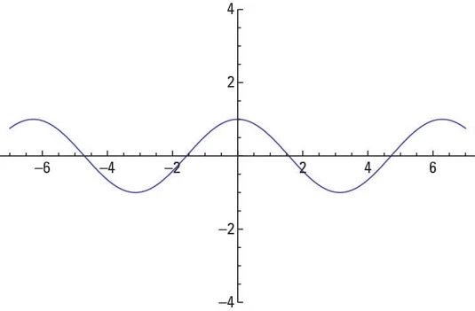
The graphs of the six different trigonometric functions are shown here. These functions are as follows: sine function, cosine function, tangent function, cotangent function, sec function, and cosec function.
Visit the trigonometry graphs website to get in-depth knowledge of the graphs of each function, their highest and lowest possible values, and several instances that have been solved.
Linear and Line Graphs
It is a type of graph that shows how data points change over time. According to the textbook’s “Introduction to Graphs” segment that covers mathematics for class 8, linear graphs are those in which all of the points connect to form a single line.
Using a line graph, for instance, is the most effective way to track how different data points develop over time. In addition, the data on a linear graph is organized into a straight line, and the chart’s axes each include two different variables.
Scatter Plot
Dots are used to represent data in a scatter plot. In most cases, they are used to illustrate the connection between two distinct aspects, such as, for instance, a person’s height and the size of the footwear they wear.
You could compare how one variable may affect the other by looking at how their height is shown along one axis and how their shoe size is displayed along the other. These are the kind of things that may be examined with the use of a scatter plot.
Using scatter plots is beneficial for determining the existence of patterns or, conversely, for deciding that there are no patterns. If, for instance, each dot on the graph seems to be placed there at random, we may deduce that the various variables are not influencing one another in any way since there is no correlation between them.
Advantages of Using Graphs
A few of the advantages of graphs are mentioned below:
Formulation of Decisions
Business leaders can study the graphs at a glance and make decisions very rapidly, which is almost never achievable with a descriptive report.
Conducting Analysis
One may think of information as analogous to graphical representation elements. A visual representation allows for the rapid study of vast volumes of data simultaneously, which may help make predictions and choices based on accurate information. This kind of comparative analysis helps gain attention and understanding quickly.
Idea Generation
Using tables, designs, and graphs to portray information results in creating a logical sequence, which helps the audience better understand the concept being presented to them.
Fewer Resources
It is possible for there to be imprecisions or mistakes in qualitative, informative, or descriptive reports. In most cases, there are fewer opportunities for error or mistake when using graphical representations since the data is shown via numerical figures, tables, or graphs.
Numbers are everywhere in mathematics. And in many cases, the figures need to be graphed for a human to comprehend the graphs correctly. Nevertheless, not every chart applies to every number, equation, or expression. As a result, you’ll discover that math involves using a wide variety of graphs.